Tag: Analytics

  • Measure the answer, not the question

    Measure the answer, not the question

    Every company sits on a huge pile of unread market research. It’s called the support inbox. Every live chat, every ticket, every email is a customer telling you in their own words what they don’t understand, what they want, and where your product or your content lets them down.

    Marketing rarely reads it. Not because nobody cares, but because nobody has time to read thousands of conversations. With AI, that excuse is gone. An agent can read every conversation from yesterday before you’ve had your coffee.

    We’ve been doing this for a few weeks now. Here’s what we learned.

    The trick: look at what support had to explain

    Our first idea was obvious: take the customer questions, check whether our knowledge base answers them, and list the gaps. It didn’t work well. Customers ask vague questions in their own words. “It doesn’t work anymore” doesn’t map to any article.

    The breakthrough was to flip it around. Don’t measure the question. Measure the answer. Look at what the support agent had to write to solve the case. If support had to explain something in detail, in writing, that explanation is exactly what’s missing from the documentation.

    With that change, the gap analysis became useful overnight. For every closed ticket, the tool compares the support agent’s answer with our knowledge base. It uses plain keyword search on a local copy of all articles, which is fast and needs no AI at all. Where there’s a real gap, it drafts the text to add. The documentation team marks each finding as open, adopted or dismissed.

    One rule keeps it honest: a topic only counts as “not documented” if the search came up empty with at least two different phrasings.
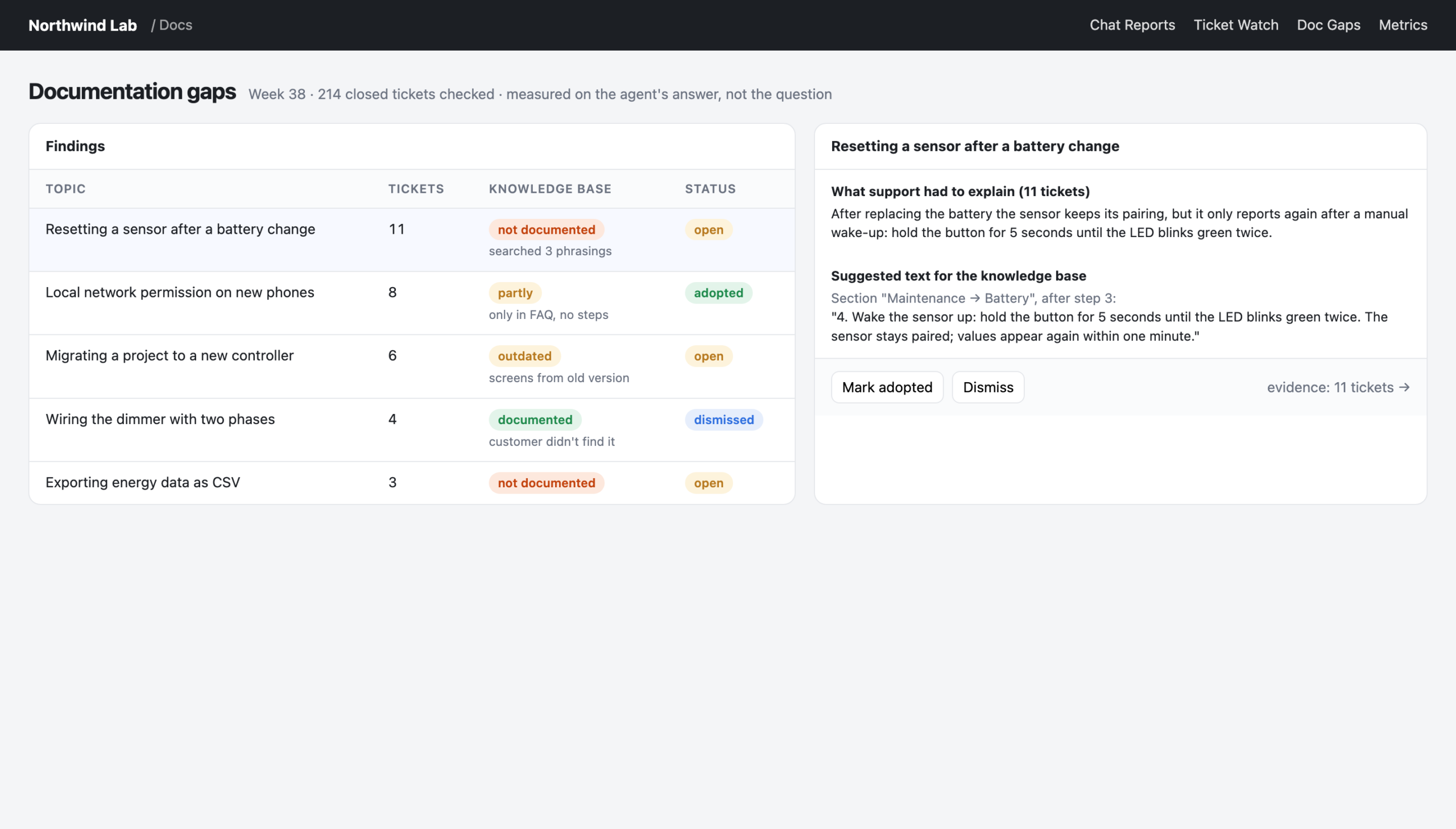
    Documentation gaps found in support answers, with suggested text
    Reconstructed view with made-up data: the real tool looks like this, but every name and number here is invented.

    Finding 1: speed was never the problem

    When we started grading our live chats, I expected slow response times. Everybody complains about waiting in chat.

    Wrong. When someone picked up a chat, they picked it up within seconds. The problem was that too many chats weren’t picked up at all. It was about coverage, not speed.

    That’s a completely different problem with a completely different fix: shift planning, not training. Once it was visible every morning, the share of chats that got answered went up noticeably within a few weeks. Nobody had to be told to hurry up. The number just had to be on the table.

    Finding 2: the silence after the first reply

    We saw the same pattern in support tickets. We started by reading a random sample of a hundred closed tickets, to see the reality before building anything. First responses were fast. But a meaningful share of tickets were closed without a real answer to the customer, and some sat silent for almost two weeks in the middle of the conversation.

    The speed was right. The silence afterwards wasn’t.

    So we built a small watch list: open tickets where the last message is from the customer and nobody has replied in days. It’s not an analysis, it’s a to-do list. It’s also one of the most-used pages we have.
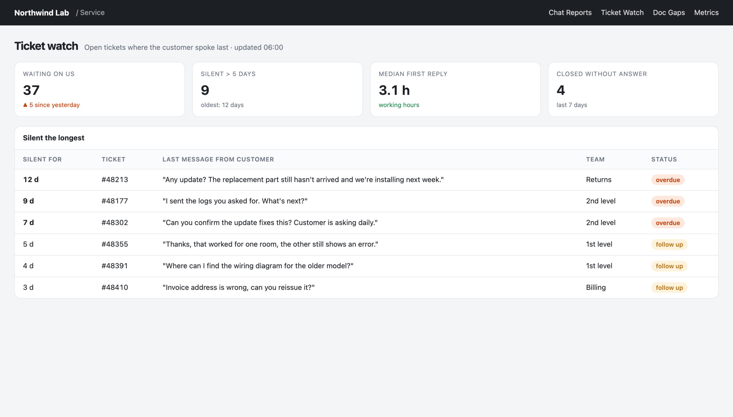
    Ticket watch: open tickets where the customer spoke last
    Reconstructed view with made-up data: the real tool looks like this, but every name and number here is invented.

    Finding 3: “answered” doesn’t mean answered

    In our social media analysis we wanted to know how well we answer comments and direct messages. The analytics tool said: almost all of them.

    When we looked closer, most of those “answers” were automatic replies sent within a minute. A human had never looked at them. We now treat any brand reply within sixty seconds as an auto-reply and list the people who are still waiting for a real one.

    The lesson generalises: whenever a tool gives you a suspiciously good number, check how it was counted.

    Why this is marketing’s job

    You could argue this is all customer service. It isn’t only that. What customers ask in support is what they will search for before they buy. What support has to explain is what your website, your product pages and your content don’t explain. Where customers get stuck is where your messaging makes a promise the product experience doesn’t keep.

    It’s also the best content briefing you’ll ever get. Every repeated support explanation is a blog post, a video or a help article waiting to be written, and it comes with the customer’s exact wording.

    How to start

    1. Read a sample yourself first. Pick a hundred random conversations and read them. You’ll know what to measure afterwards, and you’ll recognise when the AI gets it wrong.
    2. Keep the full conversation next to every AI verdict. People need to be able to check.
    3. Measure the answer, not the question, if you’re looking for content gaps.
    4. Turn findings into lists, not charts. “These twelve customers are waiting” is more useful than a trend line.
    5. Be suspicious of good numbers. Check how they’re counted.

    Your customers are already telling you what to fix and what to write. The only new thing is that you can finally afford to listen to all of them.
  • Make your AI contradictable

    Make your AI contradictable

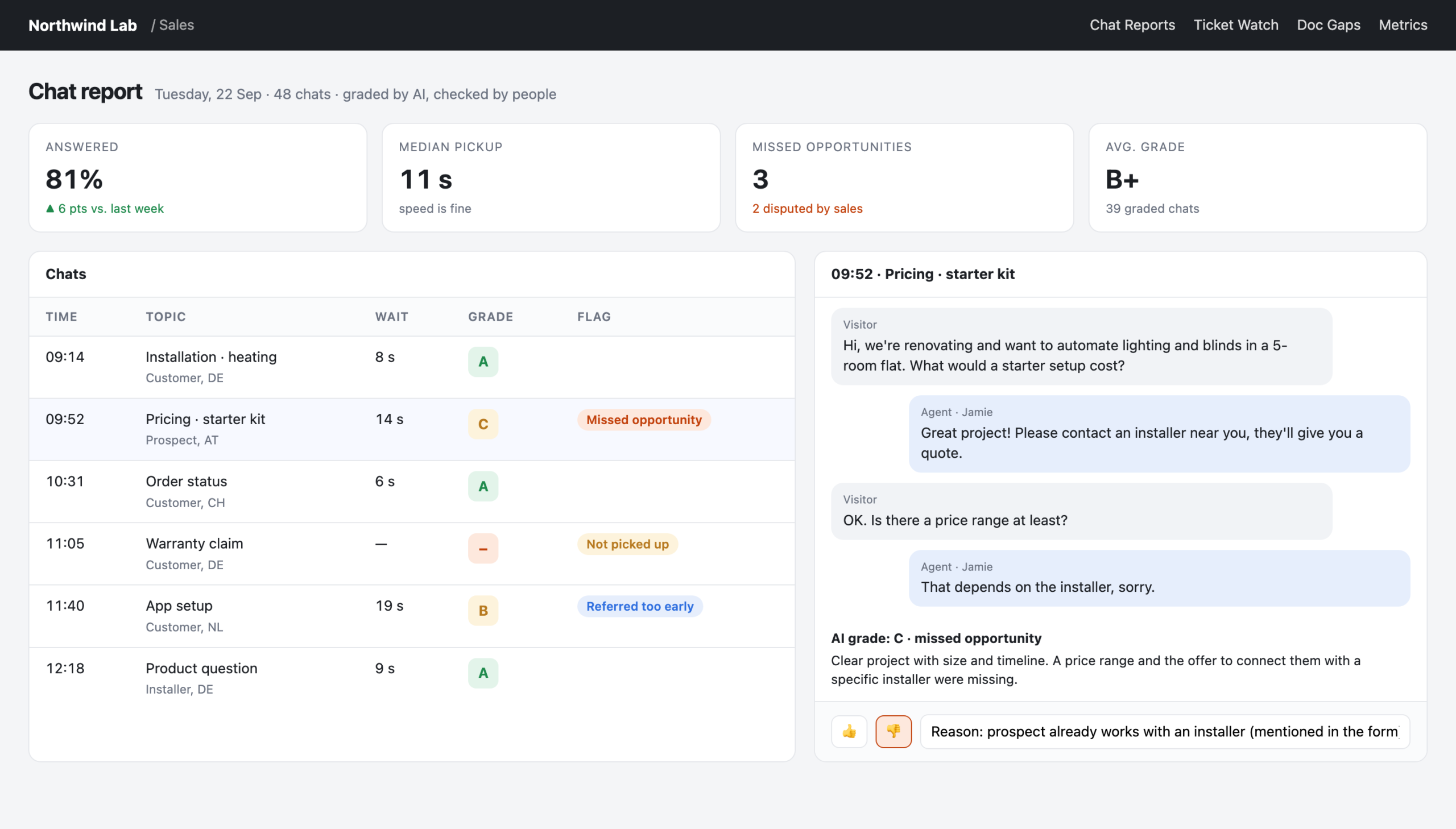
    A few weeks ago our AI-graded chat reports had a problem. Every morning, the report flagged a handful of “missed sales opportunities” in our live chats. And every morning, our sales team looked at them and said: no, that wasn’t an opportunity. That customer already had a partner. That question was purely technical.

    The AI wasn’t stupid. It was confidently wrong in the same way every day, because nothing told it otherwise.

    That’s the moment I understood the most important design rule for AI reports in marketing: an analysis nobody can contradict repeats its mistakes every day.

    Thumbs down, with a reason

    The fix was almost embarrassingly simple. Every AI grade in our reports now has a thumbs up and a thumbs down. The thumbs down has one condition: you have to write a reason. One sentence is enough. “Customer already works with a partner.” “This was a support question, not a sales lead.”

    The next day’s run reads those reasons before it grades anything. The mistakes don’t disappear overnight, but they stop repeating. And, just as important, the sales team stopped ignoring the report, because they now had a way to shape it.

    Two things I learned about this:

    A graded chat with a thumbs down and a written reason
    Reconstructed view with made-up data: the real tool looks like this, but every name and number here is invented.
    • The reason matters more than the vote. A thumbs down on its own tells the AI that it was wrong, but not why. Without the why, it just gets more cautious everywhere.
    • Feedback is also a trust signal. People trust a report they can argue with far more than a polished one they can’t.

    Don’t let the AI invent categories

    The second lesson came from topic labels. We categorise every chat and ticket by topic, so we can see what customers ask about most. For one run, I gave the AI sub-agents a list of example topics to help them along.

    They took it as inspiration. We got back fifteen new, invented labels, all slightly different, that I then had to map back to our real categories by hand. A trend chart built on labels that change from run to run is worthless.

    The rule now: the labels are a closed list. If a conversation doesn’t fit, the sub-agent answers “other” and adds a suggestion. At the end of the run, the main session looks at all suggestions at once and decides whether a new label is worth adding. Of the first eight suggestions, three became real labels. The other five were variations of existing ones.

    If you want to compare numbers over time, the AI may fill in categories, but it must not define them.

    Decline instead of guess

    We also built a documentation bot that answers product questions from our knowledge base. Before letting it near customers, we tested it on 200 real questions from support tickets and had another model judge the answers.

    The result was sobering and useful. Only a small share of answers were fully correct. Most were partially right: helpful for pointing someone to the right article, but incomplete. A few percent were wrong, and one was a proper hallucination: a command that doesn’t exist.

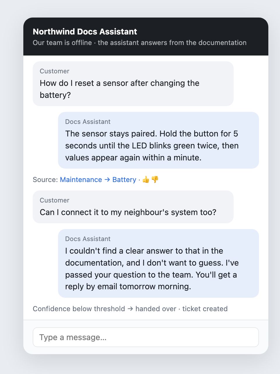
    We didn’t give up on the bot. We changed its job. It’s now a documentation navigator, not a support replacement. And we added a confidence gate: if the retrieved documentation doesn’t clearly cover the question, the bot says it doesn’t know and hands over. An honest “I don’t know” is worth more than a fluent wrong answer.

    A documentation bot that declines and hands over instead of guessing
    Reconstructed view with made-up data: the real tool looks like this, but every name and number here is invented.

    The same principle applies to our analysis tools. One of our rules for the documentation gap report: never claim something is “not documented” without searching for it with at least two different phrasings. Customers and documentation writers rarely use the same words.

    Stop, don’t invent

    Many of our reports run automatically every morning, with nobody watching. That makes one rule non-negotiable: if data is missing or a connection fails, the run stops and says so. It does not fill in the gaps with plausible numbers.

    This sounds obvious. It isn’t. A language model’s instinct is to be helpful, and “helpful” with missing data means making something up. You have to tell it, explicitly and in writing, that an aborted report is better than an invented one.

    Keep the evidence next to the verdict

    The last pattern is the simplest. Every grade, every flagged ticket, every content idea in our tools links back to the source: the full chat transcript, the actual ticket, the real Instagram comments an idea was based on. Anyone can click through and check.

    This does two things. It makes mistakes visible fast. And it keeps humans in the habit of looking at the real conversations, which is where the actual insight is anyway.

    A checklist for your own AI reports

    If you’re building AI-assisted reports in marketing, here’s what I’d put in from day one:

    1. A thumbs down that requires a reason, and a next run that reads it.
    2. Closed lists for anything you want to count over time. “Other plus a suggestion” instead of invented labels.
    3. A confidence gate. Decline instead of guess.
    4. Abort on missing data. Written into the instructions, not assumed.
    5. Evidence next to every verdict. A link to the source, always.

    None of this is about better models. It’s about making the AI’s work something people can check, argue with and improve. That’s what turns an impressive demo into a tool a team actually relies on.

  • Your best-performing post is lying to you

    Your best-performing post is lying to you

    “Which of our posts work best, and what should we do more of?”

    It’s the most natural question to ask an AI about your social media. It’s also a question where the AI can be completely, confidently wrong, and give you recommendations that point in exactly the wrong direction.

    It happened to us. Here’s how, and the rules we now follow.

    The quarter that wasn’t

    When I first had an agent analyse our YouTube and Instagram performance, the results looked great. One quarter stood out as our strongest by far, with average views per video many times higher than any other quarter. The AI’s recommendation: do more of what we did then.

    The problem: that quarter included two big campaign films with serious media budget behind them. They weren’t “performing”. They were paid to be seen. Once we took them out, the average for that quarter dropped by roughly a factor of ten, and it turned out to be our weakest quarter, not our best.

    Every recommendation built on the first version would have been wrong. And it would have looked perfectly plausible, with charts and all.

    Rule 1: separate paid from organic before you rank anything. Not as a footnote, not as a filter you can optionally apply. As the first step, every time. We now call it our iron rule, and it’s written into the analysis instructions so no agent can skip it.

    One outlier makes everything else look bad

    Even after removing campaigns, we hit a second problem. One promoted video had so many views that, compared with it, every normal video looked tiny. In a ranking based on averages, a regular good video looked more than a hundred times worse than the leader. That’s not insight, that’s noise.

    We switched to medians. The median tells you what a typical post does. It doesn’t care about the one post that went viral or got a boost. Suddenly the differences between formats and topics became visible again: which kinds of posts reliably do a bit better, which reliably do a bit worse.

    Rule 2: use the median for “typical”, and look at outliers separately. Outliers are interesting. They just shouldn’t define your baseline.

    Not all “engagement” is the same

    Different platforms count different things. On one network, the analytics tool’s “engagement” included link clicks; on another, it didn’t. Put them side by side and one platform looks far more engaging than the others, for purely technical reasons.

    Rule 3: compare within a platform, not across platforms, unless you’ve checked that the numbers mean the same thing.

    One metric, three definitions

    The same problem exists inside companies. For one of our core business metrics, we found three different definitions in circulation, in three different slide decks. Each one was defensible. Together they meant that every meeting started with a debate about whose number was right.

    We fixed it by writing the definition down once, in a single place, and building a small tool that calculates it live from the CRM. Nobody has to agree with the definition forever. But everyone uses the same one until it’s changed, in that one place.

    Rule 4: every metric has exactly one written definition. Especially when an AI is doing the calculating. It will pick whichever definition it finds first.

    Watch the small print

    A few more traps we’ve run into:

    • Currencies. Comparing partner revenue across countries against a single threshold made partners in countries with a different currency look many times bigger than they were. Always convert before you compare.
    • Auto-replies. “Replied to 95% of messages” can mean “sent an automatic message to 95% of people”. Look at how fast the replies came.
    • Privacy in the data. Some analytics exports include profile image links with access tokens in them. Strip those before anything gets stored or shown.

    Let the AI do the counting, not the thinking

    None of this means AI is bad at analytics. It’s excellent at the tedious parts: pulling data from APIs, cleaning it, scoring the sentiment of thousands of comments, drafting content ideas that link back to the real posts and comments they came from.

    But it has no idea that a post was paid for, that a platform counts differently, or that your business uses a metric in a particular way. It will produce a beautiful, confident report either way.

    So the checklist is short:

    1. Paid out first. Always.
    2. Medians for the baseline, outliers on their own.
    3. Compare like with like.
    4. One definition per metric, written down once.
    5. Read a few of the top posts yourself before you believe the ranking.

    Your best-performing post might really be your best. Just make sure it earned it.